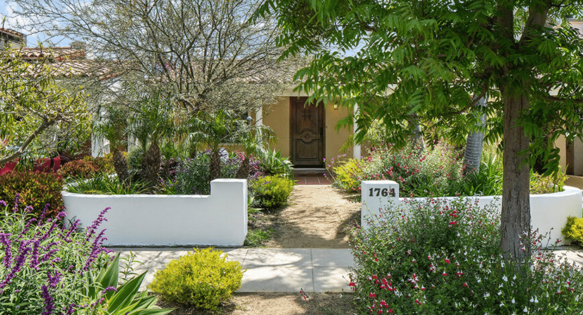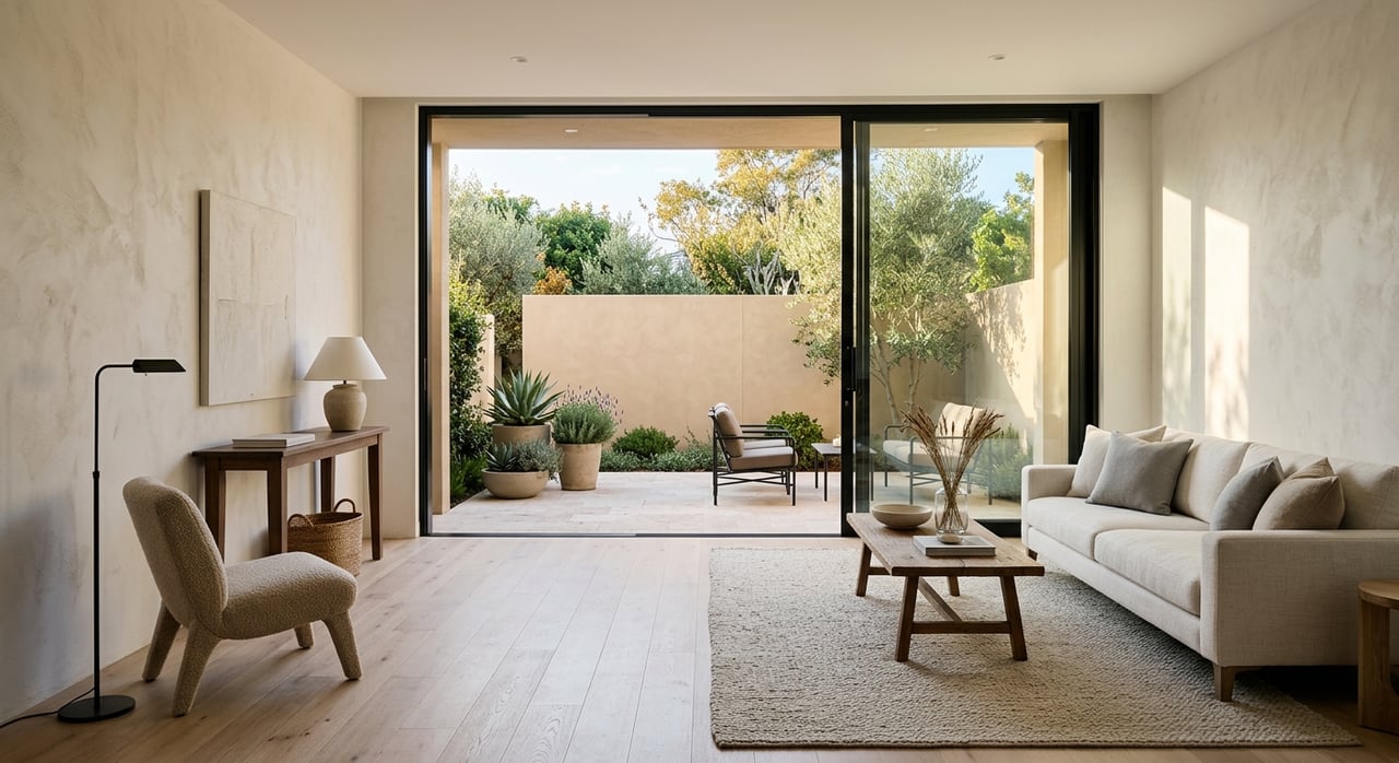
If you want your home to feel lighter, calmer, and a little more timeless, take a cue from Pantone’s Color of the Year for 2026: Cloud Dancer (PANTONE 11-4201), a soft, airy white that practically begs for texture, warmth, and beautiful “breathing room.” This Westside-friendly coastal look isn’t beachy or themed. It’s sunlit, tactile, and quietly polished, like your best day near the water.
The sunlit-coastal rules
- Light colors, warm undertones
- Texture over pattern
- A few natural materials repeated throughout
- One accent color, used sparingly
1) Start with a warm white base
Not stark. Not icy. Think sunlit.
Great coastal base tones
- Creamy whites
- Soft off-whites
- Pale sand
- Warm light greige
Where to use it
- Walls
- Large upholstery pieces
- Drapery
- Rugs
This creates the airy backdrop that makes everything else feel calm.
2) Build the palette with three textures
Coastal rooms feel good because they’re tactile, not busy.
The core trio
- Linen or linen-like fabric (drapes, bedding, pillows)
- Natural fiber (jute, sisal, seagrass)
- Light wood (oak, ash, pale walnut)
Quick texture upgrades
- Swap shiny pillows for linen or boucle
- Add a woven basket that actually hides clutter
- Choose a matte-finish wood piece instead of lacquer
3) Pick one coastal accent color
One. Not five. Coastal isn’t a rainbow. It’s a mood.
Accent colors that stay timeless
- Sea-glass green
- Dusty blue
- Soft clay/terracotta
- Charcoal (for contrast)
How to use it
- Two pillows
- One piece of art
- One ceramic vessel
- A small throw
If you can see the accent color everywhere, it stops feeling calm and starts feeling busy.
4) Make black your secret weapon
A little contrast keeps coastal from drifting into “washed out.”
Where black works best
- Window frames
- Simple lighting fixtures
- Picture frames
- Cabinet hardware
It sharpens the palette and makes whites look richer.
5) Keep patterns minimal, choose them wisely
If you love pattern, make it subtle.
Coastal patterns that age well
- Thin stripes in muted tones
- Small-scale checks
- Tone-on-tone texture (woven, nubby, stitched)
What to avoid
High-contrast nautical motifs everywhere. One is charming. Ten is a costume.
6) Bring in natural stone and ceramics
Coastal homes feel grounded when there’s something earthy holding the lightness down.
Easy ways to add it
- A stone or travertine side table
- A ceramic lamp base
- Handmade-looking vases
- Matte tile in a bathroom or kitchen
Even one solid, natural piece can make an entire room feel more designed.
7) The finishing touches that make it feel like the Westside
- A plant that adds height and softness (olive, ficus, tall grass)
- A clean, consistent scent (one signature, not five competing)
- A throw that looks like you’d actually use it
- A coffee table that’s edited, not empty
Sunlit coastal shopping checklist
If you want to do this quickly without overthinking:
- Warm white paint or textiles
- One natural fiber rug or basket
- One light wood piece
- One black accent (lamp, frame, hardware)
- One sea-glass or dusty-blue accessory
Go for it.
Sunlit coastal interiors aren’t about beach decor. They’re about light, texture, and restraint, with just enough warmth to feel inviting year-round. The goal is a home that always feels ready for an easy afternoon.